The Challenge
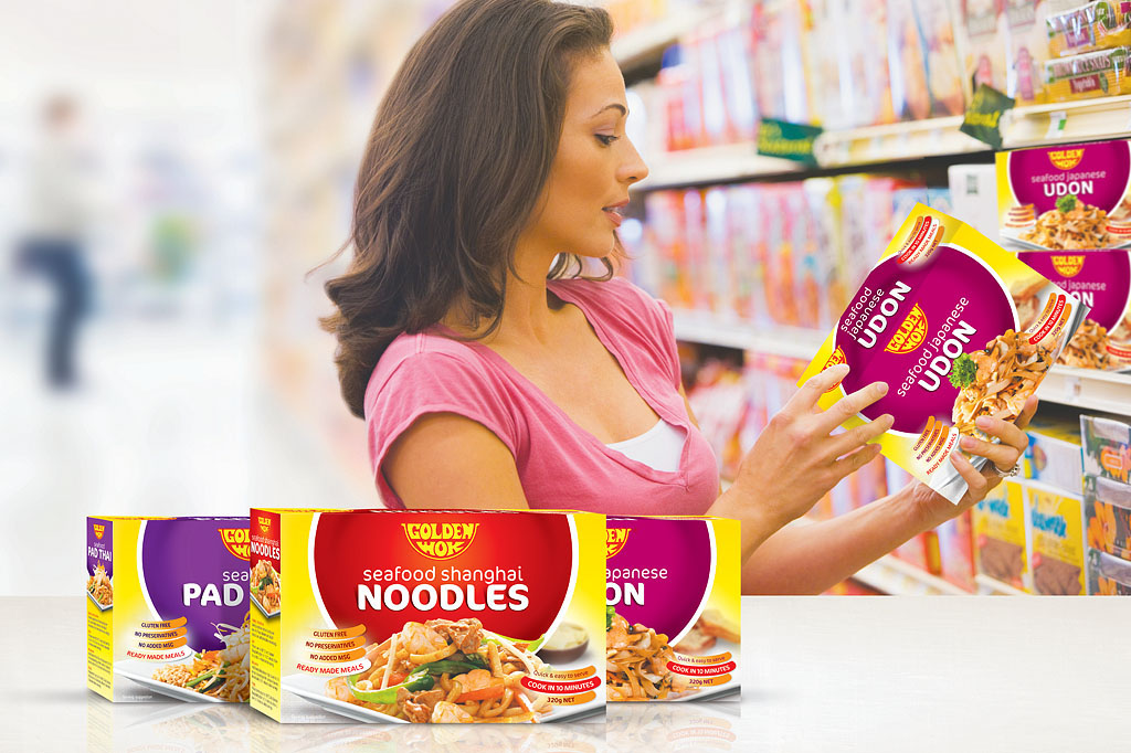
The packaging for the Golden Wok brand was plain, tired and lost. Imaginitis’ objective was to revitalise it so that it ‘jumps out from the shelf’ and communicates happiness, flavour, quality and good value.
These convenient Asian meals needed to appeal to a younger generation of Australian consumers motivated by convenience, variety and quality.
The Solution
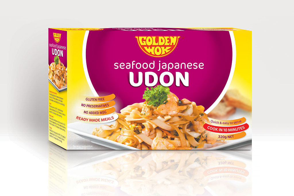
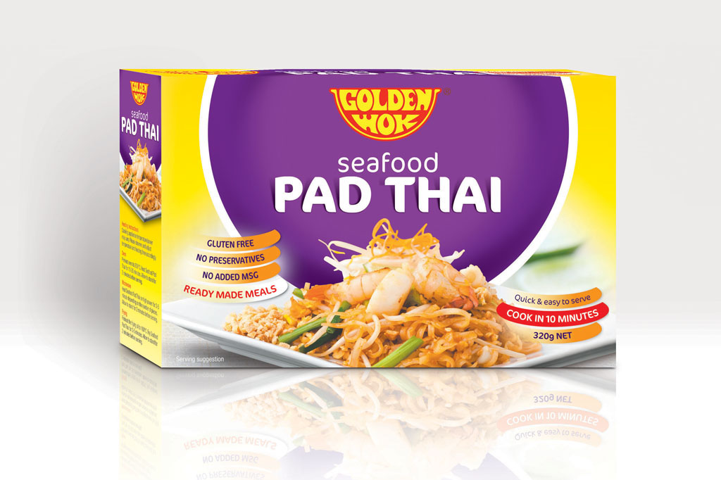
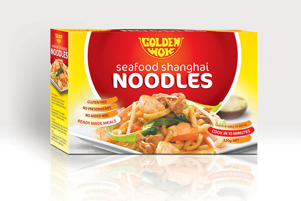
The creative concept was based on the ‘wok’ graphic element of the Golden Wok brand. The bright, pure yellow background attracted attention and evoked pleasant, cheerful feelings. Yellow is also associated to value and reinforced the brand name. Distinct colours were utilized to identify the different products. The messaging within the packaging was clear and concise. It informed the viewer of the product’s benefits, also contained within a consistent ‘smile’ graphic. Quality photography was utilised to reinforce the product’s flavour and ingredients.
The Outcome
The packaging was stronger, more distinct and it appealed to a younger Australian market, which fulfilled the initial objectives.
What we did
Design Strategy
Positioning
Art Direction
Creative Concepts
Photography
Graphic Design