Sofia Frankston’s kiosk, which is particularly popular during the summertime, sold ice cream and fish n’ chips. The owners of Sofia Frankston wanted to keep the kiosk separate from the restaurant and lift its image and product offering without alienating its core business. The kiosk was targeting people who wanted to take food away home and to surrounding areas (beach and park). Sofia Frankston needed to stimulate greater revenues during the winter months.
Sofia’s Kiosk
Sofia’s Kiosk
Brand Identity
The Challenge
The Solution
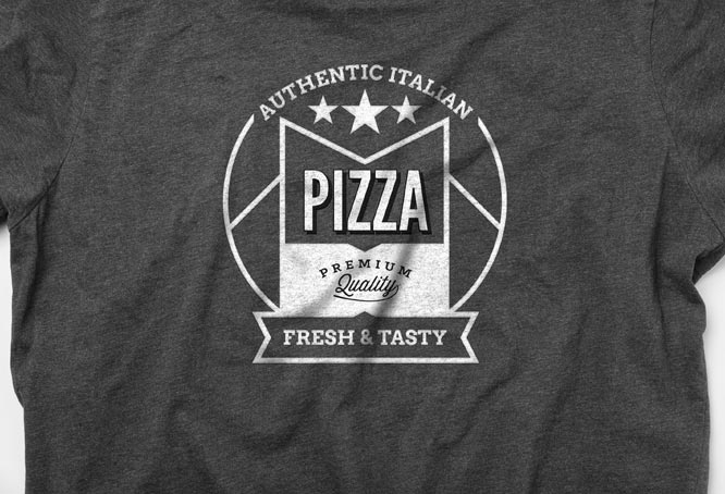
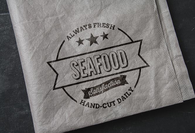
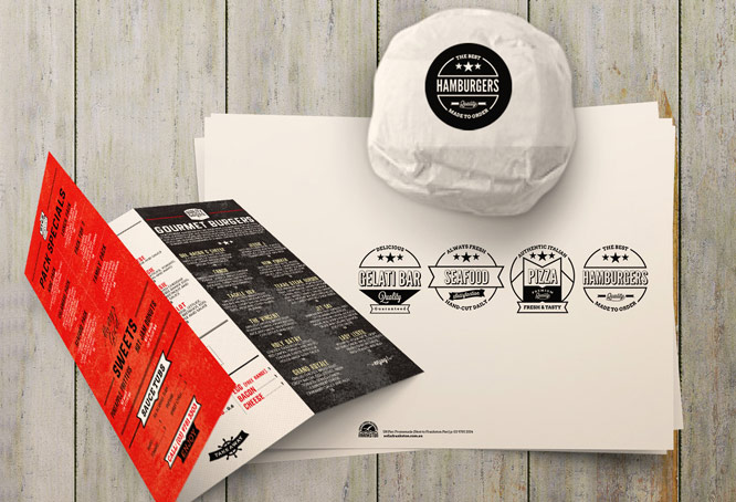
Once upon a time ordering a hamburger or chips was simple, straightforward and uncomplicated. Today everything is so much more creative and competitive. Imaginitis created a retro visual identity and a series of logo faces, all within a consistent retro ‘look and feel’ and aligned to the Sofia Frankston mother brand. The visual identity highlighted the new food offerings, including gourmet burgers, pizza, fish n chips, seafood and gelati. This solution elevated product proposition and allowed for a higher price point – yesterday’s simple hamburger became today’s gourmet dining experience.
The Outcome
The core objective was to stimulate greater revenues during the winter months. Not only was this achieved with outstanding success, summer months revenue growth exceeded expectations with the introduction of a new burger gourmet consumer.
What we did
Concept Creation
Art Direction
Design
Photography
Copywriting
Signage
Point-of-Sale
Digital Campaign


