The Challenge
Sunshine Heights Junior Soccer Club has been serving the local community of Sunshine, Melbourne (Australia) western suburbs since 1955. The challenge was to create an identity that aligned with its core function, the participation of children aged 5-16 years playing soccer.
The Solution
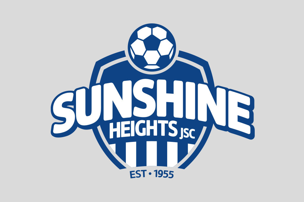
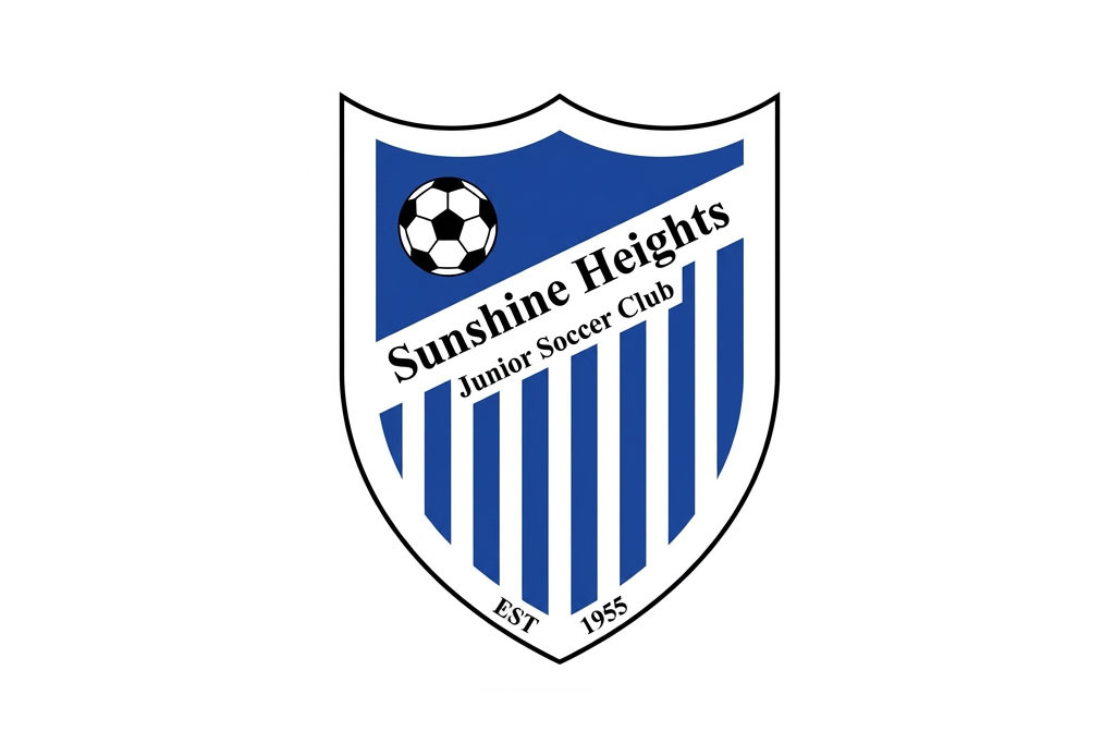
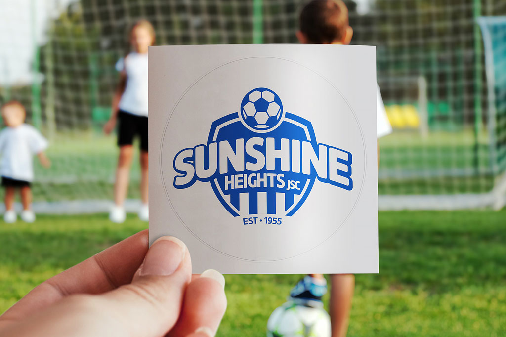
Imaginitis created a brand identity (logo) to reflect Sunshine Heights Junior Soccer Club core function whilst retaining the heritage of the blue and white stripes and primary colour, royal blue. Soft round edges and curves were introduced through the shield and typography to make it fun, happy and bold. It is also symbolic of motion, whilst retaining strength. The two key highlights of the logo are the word Sunshine, the locality, and a soccer ball embraced by the shield, the brands’ key function.
The Outcome
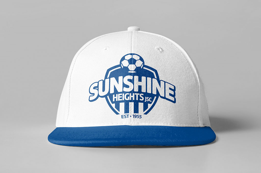
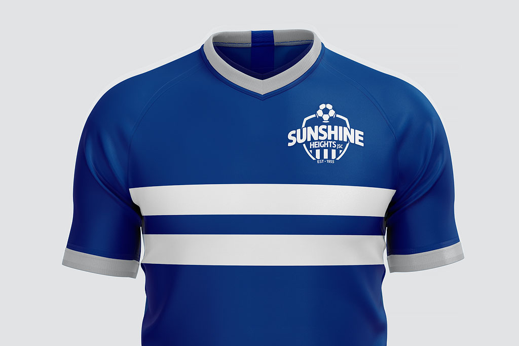
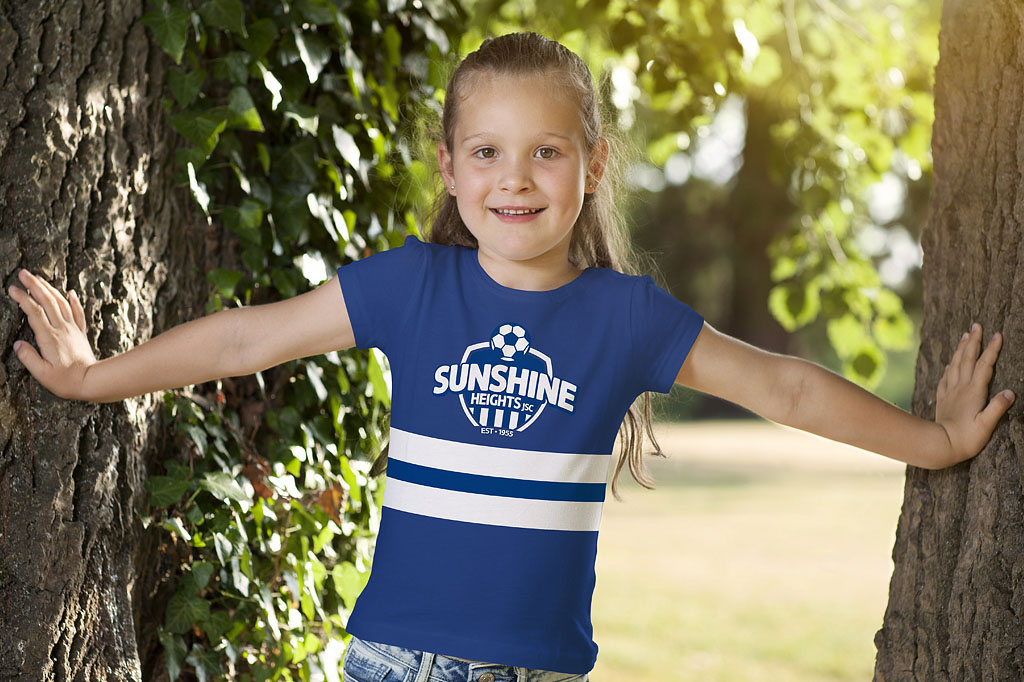
The new brand identity was warmly embraced by the club and community, creating a distinctive, memorable emblem that celebrates Sunshine Heights’ heritage while strengthening its appeal to future generations of young players and families. The refreshed identity established a consistent foundation for club branding across uniforms, merchandise and communications.
What we did
Brand Identity
Art Direction
Creative Concepts
Graphic Design